We are excited to announce the inclusion of a new metric in the Ace Metrix platform. The Polarity Score will further enhance our ability to help advertisers understand how and why video creative works with viewers. This new measure reflects the level of disagreement among respondent Ace Scores, helping to identify how polarizing an ad is, and why it performed the way it did. It shows the extent to which viewers had a common or differing view of the ad.
What is the Polarity Score?
The overall Ace Score is a census weighted average across all our respondents, but Ace Scores at the respondent level can often vary across the whole range of scores from 0 to 950. The Polarity Score reflects this spread of Ace Scores across respondents and measures the level of polarization of a given creative among a target audience.
A creative that is highly polarizing has many respondents giving high scores and many respondents with low scores – they are opposed in opinion of the ad and are in disagreement. A creative that has low Polarity is one in which respondents are either overwhelmingly positive, or overwhelmingly negative, in other words there is very little disagreement across respondents.
How does this score help marketers?
High polarization means that there is a lot of disagreement among viewers. By knowing that there are a significant number of viewers scoring the creative low, marketers can look deeper into the reasons for this polarization. For example, there may be emotions where specific visuals disturbed some viewers, or the humor went too far and offended others. By seeing how polarization changes for a given target audience, it can show how your targeting of media will minimize the overall general population polarization. Polarization is often a measure of brand risk, by showing creative is negatively affecting a lot of the viewers, advertisers can assess the size of the negative reaction.
While the Ace Score is a good overall indicator of viewer response to an ad, the Polarity Score shows how that score was achieved. An ad that scores 500 could have a majority of people that all thought it was a 500, or some that thought it was poor and some that loved it. Those instances of disagreement are when the Polarity Score will be useful. By understanding respondent disagreement, advertisers can fine tune their messaging, or fine tune their targeting. Demographic breakdowns and verbatims work in concert with the Polarity Score in understanding the why’s behind an ad’s effectiveness.
What does the picture tell us?
The graphic shows the distribution of Ace Scores among respondents, with each color representing the percentage of respondents that fall into that range of Ace Scores.
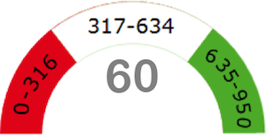
If both red and green areas are large, Polarity is high. If the green section is very large and red minimized, this means polarization is low, with viewers in agreement that the ad is effective.
What does the score tell us?
The score is the level of Polarity among a target audience. The metric ranges from 1-100, but we typically see most ads score between 30 and 70, with the average across all ads around 50. Based on overviews of hundreds of ads, here is how to interpret the scores:
<30-40 Represents very low polarization – there is a lot of agreement across viewers, whether they all agree the ad was great, or awful.
40-50 Represents low to medium Polarity – there is some disagreement present, often with a specific audience in the red area. Checking scores for the Target Audience of the ad, as well as the verbatims will show why there is some disagreement present and amongst what audience.
50-60 Represents medium to high polarization – there is disagreement present with a mix of low and high scoring viewers
60+ Should be cause for concern (when not an expected outcome) and represents high viewer Polarity – there is significant disagreement with the audience split high and low
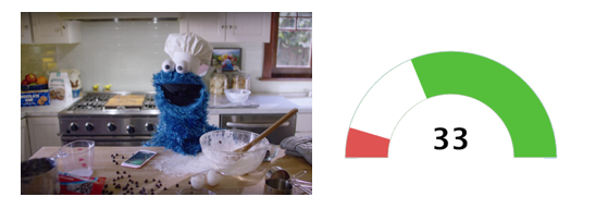
Apple, “Timer”: Low Polarity
Apple’s iPhone6 spot “Timer” is an ad with very low Polarity, with the majority of viewers agreeing the spot was fantastic. See yesterday’s blog post about the ad to understand how this low Polarity Score demonstrates its mass appeal, as one of the key pillars of performance.
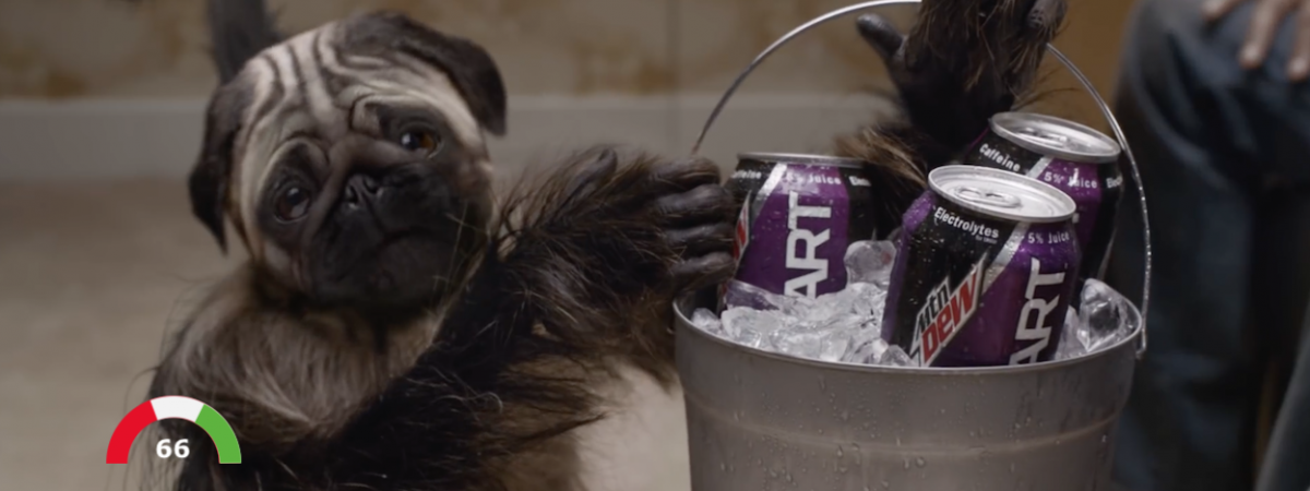
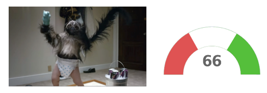
Mountain Dew, “Puppymonkeybaby“: High Polarity
Mountain Dew’s Super Bowl spot “Puppymonkeybaby” was one that baffled many and greatly amused others, ranking it one of our most polarizing ads to date.
Want to know more about using the Polarity Score as a measure of your video creative? Contact us today.